Brand
Twouring Brand Identity
Guidelines for our logo, colours and typography. Partners, press and event organisers: please follow this page and use the original files below. Do not redraw or alter the logo.
Logo
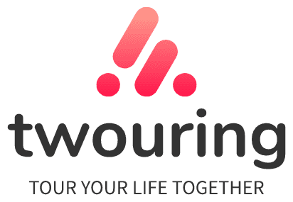
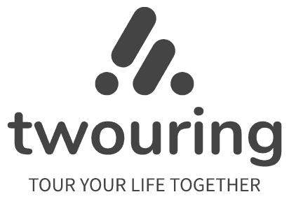
The primary logo combines the symbol, the “twouring” wordmark and the tagline. Use the full version whenever possible; fall back to the wordmark or symbol in tight spaces.


Usage rules
- Clear spaceKeep at least half the symbol’s height clear on every side. No text or graphics inside that area.
- Minimum sizeFull logo: no narrower than 120px on screen or 25mm in print. Symbol: no smaller than 24px.
- No distortion or recolouringDo not stretch, rotate, outline or add shadows. Do not use colours outside the palette.
- BackgroundsColour and black versions go on white or light backgrounds. On dark or photographic backgrounds, always use the white version.
- NamingLegal name “Twouring Co., Ltd.”, brand “Twouring 遊遊”. The wordmark is always lower-case: twouring.
Colours
Four brand colours from the LogoAI visual identity. Red is an accent: use it for emphasis, never as a full-page background.
Digital accessibility note
White text on brand red #ff0844 falls short of contrast requirements (about 3.6:1). On the website and internal tools, text and solid buttons use the deeper #d80038 (about 5.3:1, WCAG AA); the original red is reserved for gradients and decoration.
#ff0844 #d80038
Typography
Nunito for the logo and headings, Source Sans 3 for the tagline and body copy. Chinese text falls back to system fonts (Noto Sans TC / PingFang TC / Microsoft JhengHei). Both typefaces are under the SIL Open Font License.
Source Sans 3 600 / 400
Solving problems for businesses, governments and cities with technology.
TOUR YOUR LIFE TOGETHER
Google Fonts ↗Tagline
The tagline is always “Tour your life together”. Set it in spaced capitals next to the logo; in running text, use sentence case.
Need another format or have a question? Email us@twouring.com.